Featured

BLOG1: Poking an Advertisement

Let’s hear what an ad has to say about its message!

Ads are everywhere and once in a while one catches the attention to the point of dissection and scrutiny. It can be it’s rewarding, but in other times there is seriously nothing deep to pull from a simple message. So, here are a few found from downtown San Jose that we’ll “poke” some knowledge out of right now.

Our first we run across is this giant poster at Bank West. It reads: “Out here, banker’s hours look a lot like your hours. Go West.” Right below this we see the main plot of the message: “Take advantage of our Online and Mobile Banking.” Essentially it’s a message selling on option of Online and Mobile Banking.

img_6172
Bank West ad telling you to “Go West.”

Who this advertisement speaks for is obvious. It’s the working mom or dad, the individual who is too busy to be wasting time visiting a bank, but needs to update and check their banking on the go. The underlying message is to show Bank West has got you covered when it comes to online banking. It’s a clever way of saying you can access and do transactions with your bank account at any time and anywhere.

The advertisement plays on some emotion and a lot from ethos as well. For one, the image of a father and son playing ball at the park is a family-friendly touch that plays on nostalgia and possibly at memories involving money, such as buying your son ice cream or some lovable memory like that. The credibility plays a large part in showing Bank West is a reliable bank with their “our hours are your hours,” showing a reputability for understanding what a hard-working and busy person one is every day.

The brand here then has a high value, especially if the online/mobile features are quick and responsive, because this is someone’s money, and one trusts their bank to have fast and easy access to that money.

img_6170
Teleflora ad for “send a smile.”

Here’s another advertisement from Teleflora to poke at, and one that is wonderfully simple and effective. The brand’s message is to buy their Be Happy Bouquet seller, and if one buys this particular bouquet, it’s the equal amount of having sent a smile to someone’s home.

While one may consider the audience to be universal to this message, another moment’s thought would bring one to realize the purpose of the message is to send flowers to cheer someone up, and that you care. This particular message wouldn’t work with an audience who needs flowers for a funeral. Thinking a little harder, the message is largely dependent on a road of pathos. It plays on the emotion of the expectation of happiness or self-gratification if one buys flowers for someone. It is as simple as it gets, but it works.

The brand value could be considered relatively average. Picking flowers from Safeway would work fine for the occasion presented in this message, but this Teleflora add wants the viewer to know one could pick much better, articulated flowers with specific color choices to cater to the audience’s needs.

And there we have it; two advertisements picked apart to its essential parts. This is how effective advertisement could be, even if it is simple or obvious or relatable. So go out and see some ads for yourself, and consider how they pick up your attention.



BLOG3: The Fruits of Grassroots

Sometimes advertisements don’t just stay on a poster and billboard, and here’s how it works!

Today, we’ll be looking at a few ad campaigns to demonstrate the effectiveness of grassroots advertising, a non-traditional marketing process. Instead of spending money and effort to purchase a radio or T.V. spot, a grassroots strategy encourages less spending and greater mobilization for customers to promote the product and/or service one wants to promote. Let’s start looking at some campaigns to gain a better picture.

Radiohead’s In Rainbows Campaign (2007)

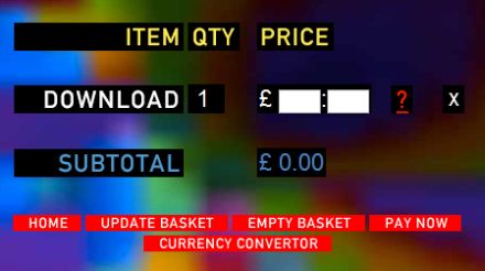
radiohead-in-rainbows
Radiohead’s In Rainbows Download Webpage.

This one is a favorite of mine.

Back in the younger days of the internet when it was still considered a grassroots method of advertising, the process of an album’s campaign is largely tradition to what we still see today: a big record label promoting the singles through airplay, a music video spot on T.V., the physical sell of CD’s into the market, and the rise of big ad placements all over social media sites. While the internet largely disrupted the cycle with streaming options and piracy, Radiohead saw it fit in their current situation to disrupt that process back with something largely unheard of at the time: a pay-what-you-want “honesty” box. No strings attached. You could listen to the album right now, and you didn’t have to pre-order a physical nor spent a single cent on the digital release.

While many critics like Gene Simmons of Kiss were unhappy at the “unruly” destruction of the music industry at hand, Radiohead begged to question the philosophy of always paying the artist.”How much is music worth to you?” they implicitly questioned, and while many stats brag that the download sales figures were low and torrenting offset the number coming from the Radiohead website itself, the fact is Radiohead amassed over 3 million download on October of that year with a healthy $10 million in revenue. In Rainbows‘ sales were bigger than all of their released albums combined, making it their most well sold album to date!

I think the reason why it was so effective, and largely influential years later, is how it brought together the artist and audience in an intimate manner, focusing not just on the Radiohead fan demographic but also on the average music listener to download something for free and pick whatever they wanted instead of having to purchase the whole album. It was a campaign that encouraged convenience but also gave the option to support the artist directly with all the money you had. Another reason it blew up is the unconventional model it championed (while in reality was only a temporary marketing process never used again) caught the attention of the media and music industry to respond and react in ways that brought more promotion to the band with zero spending. A last important factor to note is such a strategy would have tanked realistically, but Radiohead managed to be the right band and right personality to flagship their strategy to a victory.

UNIQLO Cubes (2011)

POP-UP-UNIQLO-Pop-Up-Store-by-HWKN-New-York-05.jpg
The UNIQLO Cubes set up in New York City.

While this one is a little more costly in the spectrum of grassroots, pop-up shops are an increasingly attractive method of promoting fashion brands and is often a campaign strategy for the music industry as well to create word-of-mouth discussion (just look at the pop-up shops for Frank Ocean’s Blonde that increased the hype).

UNIQLO being a Japanese-exclusive fashion brand at the time was already popular for its non-traditional advertising and its unique motto of selling clothes that are less about standing out and more about being clothes for everyone to wear. Their demographic was to reach casual wearers who want the comfort but also the colorful look of a “high-end aesthethic.” This would include any age group as they kept to a unisex design.

The UNIQLO Cube consisted of small, compact cubes with its interiors consisting of shelves of the product hugged against the walls so you could see a blur of colors from the outside of the cube. These shops designed by Hollwich Kushner studio were set up in New York City, New York for its introduction to the American market, and I would say they were a remarkable success as UNIQLO made an impact in the American market with set up shops nationwide after. Subsequent pop-up shops would follow like converting cargo caravans into temporary shops and making the Cubes a worldwide tour. A major reason the pop-up shops worked is because of the major word of mouth, especially on a location like New York City. It attracted not only casual wearers but its minimalist design would attract artistic people as well. The unisex wear could also be a large factor of why it worked as well, being inclusive of everyone rather than a specific gender.

BLOG2: The Flesh of Stereotypes

Discussing how stereotypes work and their impact

The world of advertisement is a balancing-rope, almost like an art in a sense, teetering the brinks of clever writing and social and cultural awareness. Stereotyping, in the purest sense within advertising, is about targeting a special demographic in order to enlarge the established appeal of a product or the brand, and it can either backfire or be congratulated in a matter of minutes on the internet. Whether racial or gender-specific, the answer of whether it’s moral or right to use stereotypes as a mechanism for advertising widely varies. From Morris Holbrook’s 1987 journal article of the “mirror that advertising holds up to social mores, norms and values” to Yorgos Zoto’s 2014 paper on the rise of female stereotypes in advertising, the debate will be an ongoing trial for as long as advertisement is kept alive.

For the sake of this post, it may not be always right to use stereotypes at an outright, but when it does a good job to subvert expectations, I just can’t help but get behind something potentially amazing. This is admitting racism and gender-conformity  is still prevalent however, because there are some horrendously done and questionable ads that still happen due to lack of focus groups and the occasional “just because.”

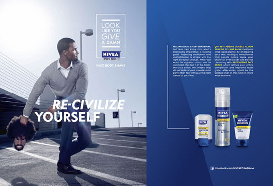
nivea-ad-racist
Nivea’s 2011 banned ad headlining “Re-Civilize Yourself”

To get a sense of what we’re dealing with here, let’s take a look at Nivea’s banned advertisement from 2011. Brought to light not only on social media, but also from writers Jen Ortiz of Business Insider and Justin Fenner of former Styleite.com over the blatant stereotype of black men with afros and beards, “as embracing a tonsorial style that isn’t close cropped and clean-shaven will make you look like a total beast,” Fenner comments sarcastically. As Nivea pulled down the ad and posted a public apology for the incident, inciting that the only intention was to spread diversity with their brand, one has to question whose fault this is and the lack of effort to fact-check the credibility for letting such an ad through.

As advertisers, there has to be a sense of awareness on account of disparities like Nivea’s ad in the market, but there has to be at least the extra step of having a test or focus group view the ad before it hits the billboards. One may argue Nivea did similar ads before with a white model holding a decapitated head with a beard as well, but At least with ads that have a specific purpose on using stereotypes to create an effective ad, one has to have a focus group made of the demographic approached to become more than just the regular tragedy in the industry.

This one last example is of a recent Japanese ad for cosmetic brand, Shiseido, back in 2015 that has to be one of the best ads from that year. From the Watts of Tokyo ad agency, Shiseido was barely ten days old when it ran the smashing “High School Girl?” ad hit at a critical cultural climate at the time. Essentially, the message breaks down to “not only girls can look pretty, boys can too,” and it plays eloquently on gender norms in beauty commercials that hasn’t been as refreshing since Dove’s “Evolution.”